Following my Disinformation Visualization workshop at the Info Activism Camp, the wonderful people at the Tactical Tech Collective have invited me to publish these ideas as an essay on their site. I am cross-posting the opening here and encourage you to read the whole thing on the Visualizing Advocacy site (and get their wonderful book too)
Seeing is believing.
When working with raw data we’re often encouraged to present it differently, to give it a form, to map it or visualize it. But all maps lie. In fact, maps have to lie, otherwise they wouldn’t be useful. Some are transparent and obvious lies, such as a tree icon on a map often represents more than one tree. Others are white lies – rounding numbers and prioritising details to create a more legible representation. And then there’s the third type of lie, those lies that convey a bias, be it deliberately or subconsciously. A bias that misrepresents the data and skews it towards a certain reading.
It all sounds very sinister, and indeed sometimes it is. It’s hard to see through a lie unless you stare it right in the face, and what better way to do that than to get our minds dirty and look at some examples of creative and mischievous visual manipulation.
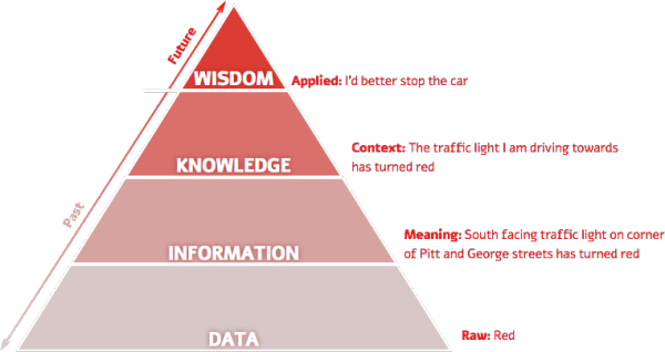
Over the past year I’ve had a few opportunities to run Disinformation Visualization workshops, encouraging activists, designers, statisticians, analysts, researchers, technologists and artists to visualize lies. During these sessions I have used the DIKW pyramid (Data > Information > Knowledge > Wisdom), a framework for thinking about how data gains context and meaning and becomes information. This information needs to be consumed and understood to become knowledge. And finally when knowledge influences our insights and our decision making about the future it becomes wisdom. Data visualization is one of the ways to push data up the pyramid towards wisdom in order to affect our actions and decisions. It would be wise then to look at visualizations suspiciously.

