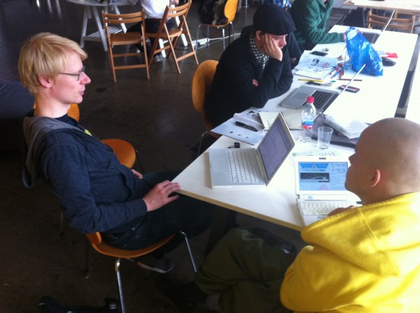
The 1st Open Knowledge Festival was also the host of the 1st Dis-Information-Visualization workshop, a critical attempt to actively explore the dark side of information visualization. In the full day workshop (led by me, Mushon Zer-Aviv, and organized by Pixelache and the Mushrooming Network) 4 groups were encouraged to lie with infographics. Rather than falsifying the data, the dis-info-visualizers have manipulated its meaning by creating truthful, yet misleading representations.
We started with an introductory presentation offering a few critical tools through which to investigate (and generate) visual manipulation. The talk suggested that rather than looking at data information visualization as “Beautiful Evidence” (to quote the title of a book by Edward Tufte) we should read them as often beautiful and sometimes even seductive arguments.
The groups used the division of content / structure / presentation as 3 possible junctions where the manipulation might happen. In the content stage, the data can be tainted by the way it is being gathered (for example, a survey asking: “Should the killing of babies be legalized?” Would generate different results than one asking “Should abortion be legalized?”). The structure stage allows to pick and choose selective sampling of the data, manipulative standardization of numbers or misleading statistical correlations. Finally the presentation stage, provides many manipulative tools in the use of color, composition, contrast, animation, interaction, the use visual metaphors and so on.
The groups have worked intensively throughout the day, the general creative atmosphere was one of amused guilt. At the end of the workshop these were the final works presented:
Stand with the Finnish market leaders / Hannu Aarniala, Hannu Salmi & Mace Ojala

A poster addressing the critical debate concerning the centralization of the Finnish market, largely controlled by 2 supermarket chains. The group chose to (mis-)represent the division of the market by singeling out the 20% not controlled by the duopoly as non-Finnish, foreign and suspeciously “other”. The manipulative use of color, visual symbolism and language could even suggest that Finland might do better by allowing the two gients to control an even bigger chunk of the market.

Design Drinking / Ashkan Shabnavard & Ennisofia Salmela

As you may or may not know, studies suggest that extended alchol consumption leads to wider innovation. At least that is the “beautiful argument” made by the “Design Drinking” movement (if this reminds you of the “Design Thinking” trend, it is probably not coincidental). A world map is used to present the results of multiple studies, mostly taken out of context. For example, a study showing that educated people consume more alcohol was turned on its head to say that larger alcohol consumption leads to higher education levels. The map is even drawing the correlation between lowered alcohol consumption and the civil war in Syria. Coincidence? Maybe not…

How big a stool? / Ben Dromey
Giant Stool equivalent from Ben Dromey on Vimeo.
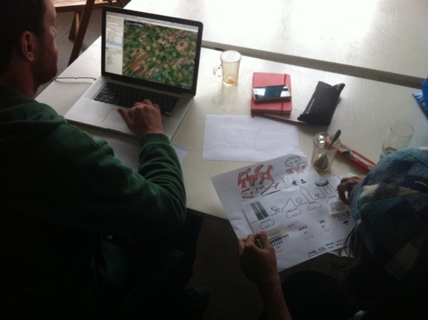
Ben and his friend decided to offer a different way to represent the enormous amount of wood produced by companies. Pulling the data from one company’s annual report, the two have done the math and used Google Earth to present a menacing colossal stool towering above the streets of Helsinki. The video and still images provide a cross between War of the Worlds and District-9. The choice to express the amount of yearly wood industrialized by as a huge stylish stool is completely irrelevant to the reality of the wood market. Interestingly, the resulting image might be perceived as flattering for the ccompany’s shareholders, and alarming to anyone else.
Is unemployment really rising? / Elina Alatalo & Juho Järvi


—-
Scheduled at the end of the Open Knowledge Festival, the Dis-Info-Vis workshop provided an attempt to reexamine the hype around big data. It showed how the opening of data alone may not automatically lead us up the path towards information, knowledge and wisdom. And that the underlying patterns and stories that are exposed through accurate data visualization may often be misleading and manipulative. We hope this experience may lead to a more responsible work and to a more critical perspective in the handling of data, it’s visual representation and the open knowledge that they aim to construct.

One thought on “Dis-Information-Visualization Workshop Summary / Helsinki Sep 2012”
Comments are closed.