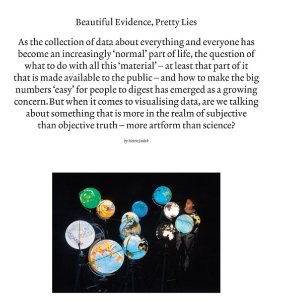
Art Review’s wonderful Hettie Judah interviewed me and some of my dear colleagues for a piece about data, its visualization and their discontents. The article refers to my previous writing about Disinformation Visualization. It was just published in Art Review’s December 2014 issue:
As surveillance culture and the mass gathering of data have grown, so too has the culture of data communication. All the information swept up in the efficient, automated gluttony of the information-technology data grab needs to justify its rude acquisition – with every movement, transaction or conversation becoming potential fodder in the scramble to find meaning in the pattern of human behaviour, the less sensitive fruits of ‘big data’ are released to the public, making humanity en masse not simply the subjects of the data gathering but, increasingly, the enthusiastic consumers of it too. Given that little of the world’s population is equipped with advanced skills in statistical analysis, or even nimble numeracy, increasingly the way we consume the data made available to us is in the form of diagrams.